CA | Brand redesign
Over the years Chartered Accountants Australia New Zealand had slowly turned into a bunch of disparate and inconsistent brands. Our task was to bring the myriad of separate organisations together under one, recognisable brand that worked across the myriad of their different divisions.
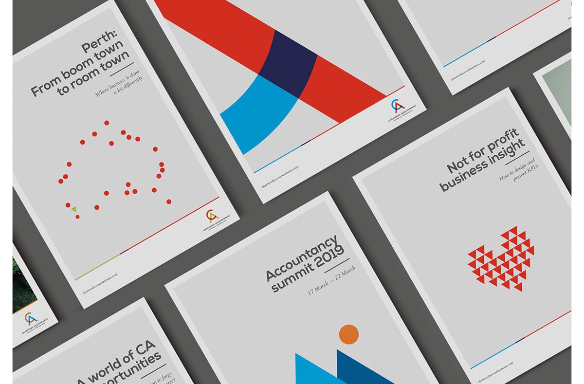
We took shapes from the logo and created a visual system that could unite every division.
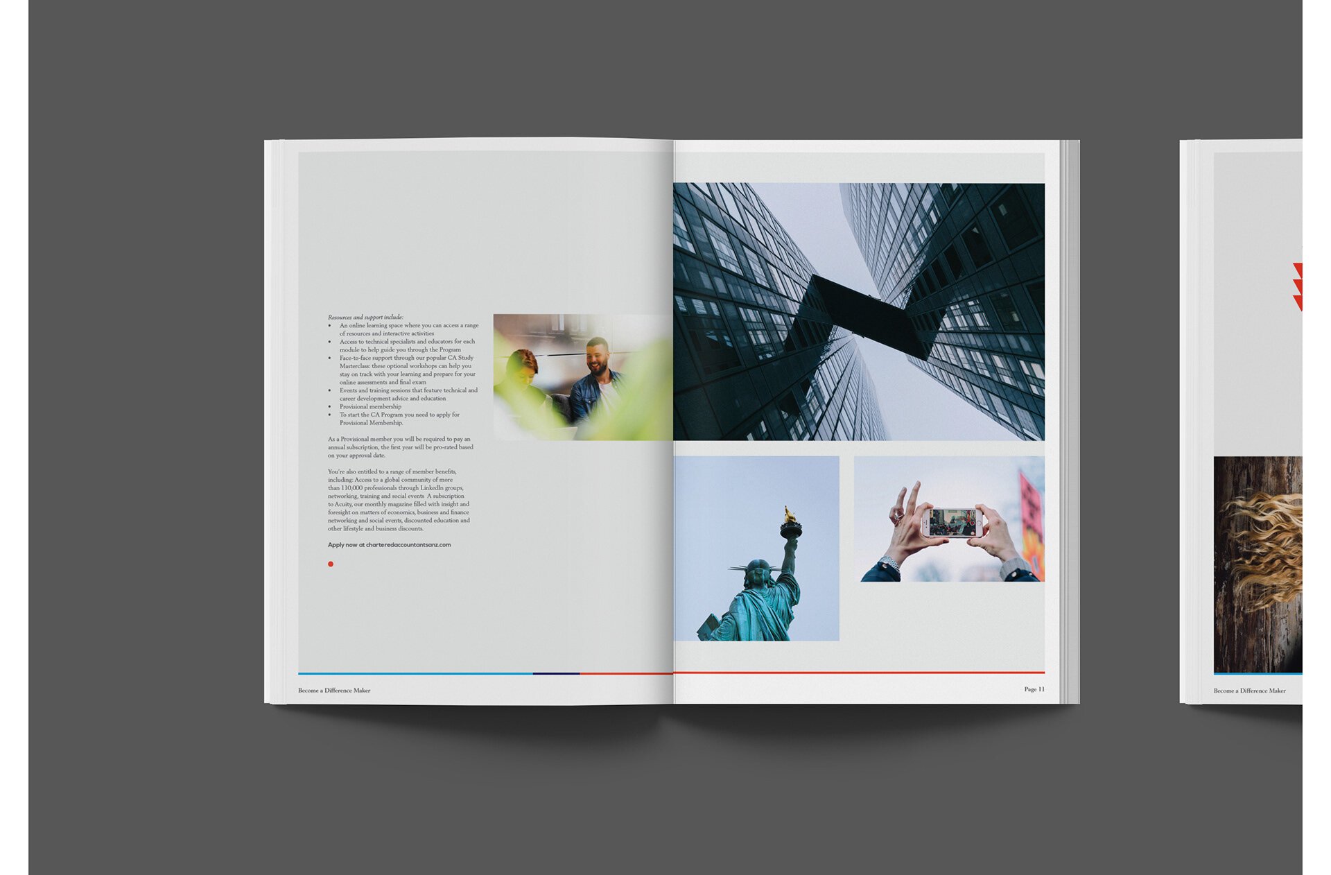
Our framework subtly brought to life Chartered Accountant’s lifelong obsession with numbers, with right-aligned copy and bottom lines.
We subtly incorporated our brand shapes into our visuals.


